Plotting
cait.versatile offers often used, out-of-the-box plotting routines.
All of them have a number of keyword-arguments which can be used to
style them. Those keyword arguments are:
backend (str, optional): The backend to use for the plot. Either of
['plotly', 'mpl', 'uniplot', 'auto', i.e. plotly, matplotlib or uniplot (command-line based; has to be installed separately as this is probably not relevant for all users), defaults to'auto'in which case'plotly'is used in notebooks and'uniplot'on the command line (if installed).
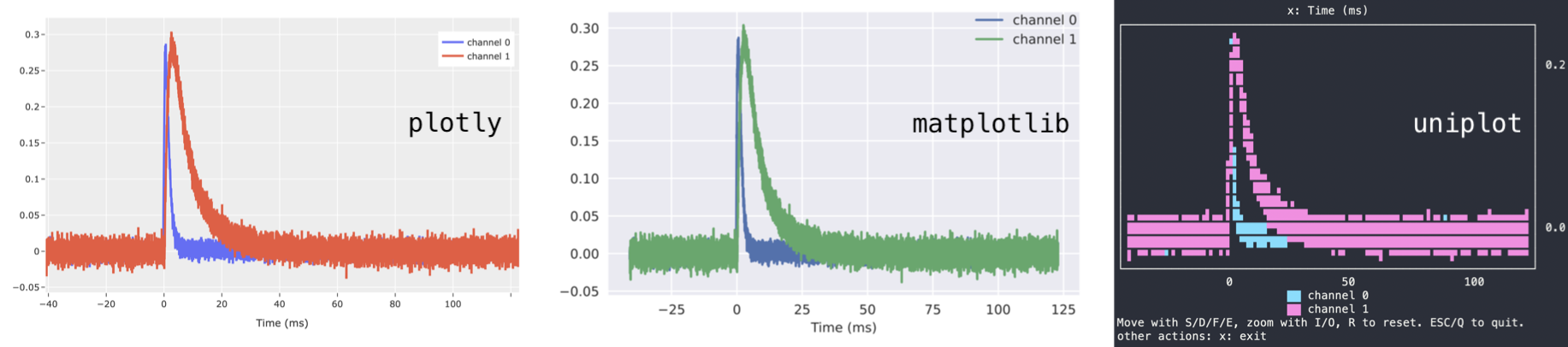
template (str, optional): Valid backend theme. For
plotlyeither of['ggplot2', 'seaborn', 'simple_white', 'plotly', 'plotly_white', 'plotly_dark', 'presentation', 'xgridoff', 'ygridoff', 'gridon', 'none', formpleither of['default', 'classic', 'Solarize_Light2', '_classic_test_patch', '_mpl-gallery', '_mpl-gallery-nogrid', 'bmh', 'classic', 'dark_background', 'fast', 'fivethirtyeight', 'ggplot', 'grayscale', 'seaborn-v0_8', 'seaborn-v0_8-bright', 'seaborn-v0_8-colorblind', 'seaborn-v0_8-dark', 'seaborn-v0_8-dark-palette', 'seaborn-v0_8-darkgrid', 'seaborn-v0_8-deep', 'seaborn-v0_8-muted', 'seaborn-v0_8-notebook', 'seaborn-v0_8-paper', 'seaborn-v0_8-pastel', 'seaborn-v0_8-poster', 'seaborn-v0_8-talk', 'seaborn-v0_8-ticks', 'seaborn-v0_8-white', 'seaborn-v0_8-whitegrid', 'tableau-colorblind10', defaults to'seaborn'forbackend=plotlyand to'seaborn'forbackend=mpl. Note that setting a template for backend'uniplot'has no effect.height (int, optional): Figure height, defaults to 500 for
backend=plotly, 3 forbackend=mpland 17 forbackend=uniplotwidth (int, optional): Figure width, defaults to 700 for
backend=plotly, 5 forbackend=mpland 60 forbackend=uniplotshow_controls (bool): Show button controls to interact with the figure. The available buttons depend on the plotting backend. The default depends on which higher-level plotting routine is used. Available options when
show_controls=Trueare e.g..pngand.pdfdownload of matplotlib figures or the calculation of data means/stds of plotly figures.
Note
Furthermore, they provide functions set_xlabel, set_ylabel,
set_xscale, set_yscale, add_line, add_scatter,
add_histogram, update_line, update_scatter,
update_histogram to change the appareance of plots after they were
constructed. See documentation of class cait.versatile.plot.viewer.Viewer for details.
Basic Plotting Classes
The four basic plotting classes are Line, Scatter,
Histogram, and Heatmap. Their working principle is identical. You can either pass
a list (or numpy.ndarray) to the constructor, or a dictionary whose
keys and values will turn into legend entries and plotted
lines/scatters/histograms. Additionally, you can specify xlabel,
ylabel, xscale, yscale, as well as all the general keyword
arguments described above.
Example:
import cait.versatile as vai

# If x-data is not provided, the index is used for the x-axis.
# If y-data is just an array, it will be plotted as such.
# If y-data is a dictionary, its keys will be used as legend lables and its values are plotted.
# Axis lables and scales can also be provided.

l = vai.Line([1,2,3,3,2,1])
vai.Line({'line1': [1,2,3,3,2,1], 'line2': [2,4,6,5,3,1]})
vai.Scatter([1,2,3,3,2,1], backend="mpl", xlabel="x", template="seaborn")
vai.Scatter([1,2,3,3,2,1], show_controls=True, backend="mpl")

# If bins are not provided, the backend's automatic binning is used
# If bins is an integer, it's the number of bins to use
# If bins is a tuple of the form (start, end, nbins), it is used to do the binning
# The functionality of providing just an array for the data as opposed to
# a dictionary is identical to Line/Scatter

h = vai.Histogram({'hist1': [1,1,1,2,3,4,4,5,6,7,5,3],
               'hist2': [1,1,0,2,3,4,4,0,6,7,5,3]},
            bins = 100,
            ylabel='y')
Higher level Plotting Classes
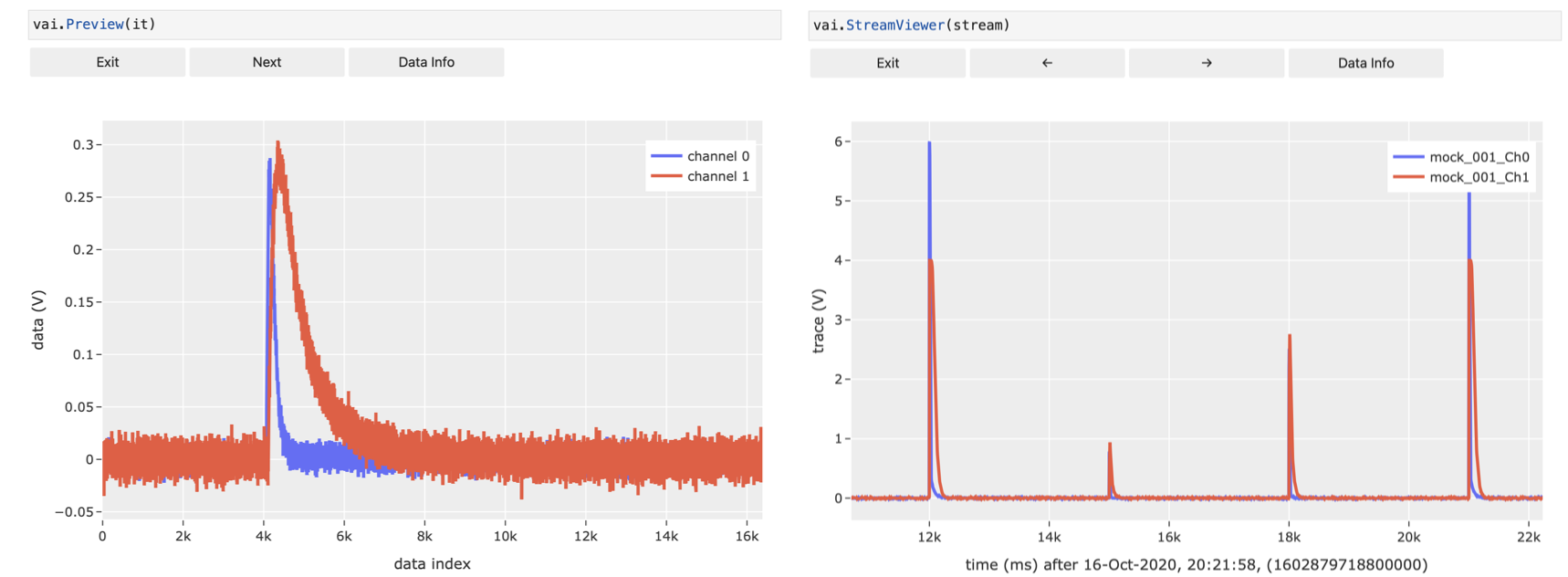
It is very handy to define the following two classes to inspect data quickly:
Preview: Inspect events in an event-iterator-object or action of a function on those events.
StreamViewer: View the raw data of a stream file.
Example:
# `cait.versatile` also includes functions, which implement a `preview` method (see below)
# It also implements iterators over events.
# Their interplay can be visualized with `vai.Preview`.
# Alternatively, it can also be used to show just the iterator of events.

# Show just events in iterator
it = dh.get_event_iterator("events")
vai.Preview(it)

# Show effect of removing baseline for events in iterator
it2 = dh.get_event_iterator("events", 0)
vai.Preview(it2, vai.RemoveBaseline())

stream = vai.Stream(hardware="vdaq2", src=fpath)
vai.StreamViewer(stream, template="plotly_dark", width=1000, downsample_factor=100)
It goes without saying that all the keyword arguments for backend, etc. work here as well.
ScatterPreview: A scatter plot where you can click datapoints and preview the underlying voltage trace. Also allows selection and removal of datapoints (similar to
VizTool). This tool only works withbackend='plotly'because it requires data selection which is not supported by a general backend.
Example:
import cait.versatile as vai

# generate mock data and calculate main parameters
it = vai.MockData().get_event_iterator().with_processing(vai.RemoveBaseline())
f = vai.MainParameters(dt_us=it.dt_us)
mp_dict = {k: v for k, v in zip(f.names, vai.apply(f, it))}

# plot two main parameters and apply some formatting
# (assigning it to a variable is not necessary but allows for additional functionality)
prev = vai.ScatterPreview(x=mp_dict["pulse_height"][:,0],
                       y=mp_dict["decay_time"][:,0],
                       ev_it=it,
                       xlabel="pulse height channel 0",
                       ylabel="decay time channel 0",
                       width=500)
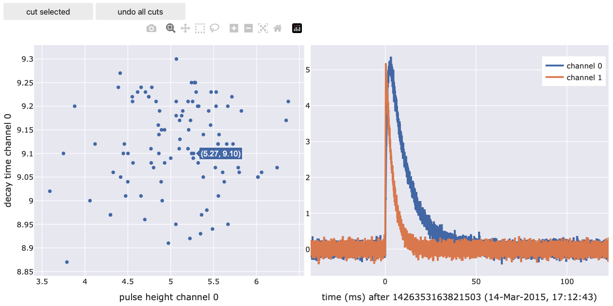
You can use the lasso tool to select a number of events. These events are then directly accessible through prev.selected_events (returns an EventIterator) and prev.selected_inds (returns the indices of the selected events). Using this, you can for example do things like this:
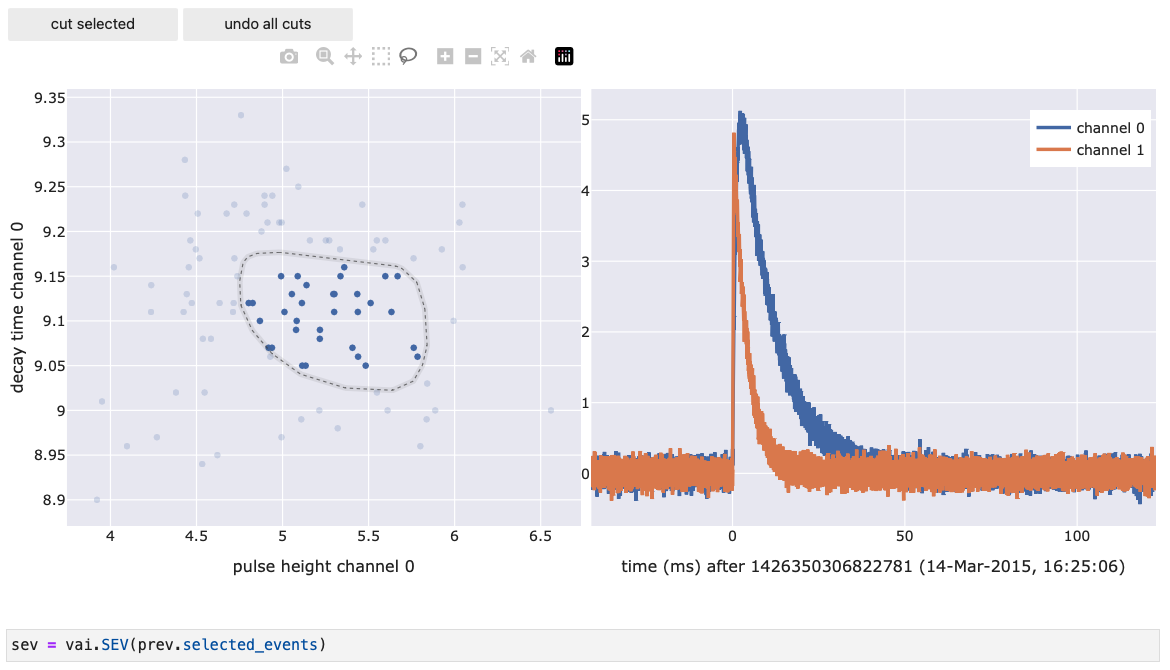
Advanced examples
This section is a collection of previously asked solutions to more advanced plotting problems:
Basic plot with button to click through data:
To preview events or a function’s effect on events, you would usually use cait.versatile.Preview.
If you just want to add some line on top of the plot, you can use the .add_line (or .add_scatter, etc.) on Preview (see cait.versatile.plot.viewer.Viewer for all available methods).
import cait.versatile as vai

# normal usage
ev_it = vai.MockData().get_event_iterator()[0].with_processing(vai.RemoveBaseline())
vai.Preview(ev_it, vai.MainParameters())

# with static line added
vai.Preview(ev_it).add_line(x=ev_it.t, y=np.ones_like(ev_it.t), name="some line")
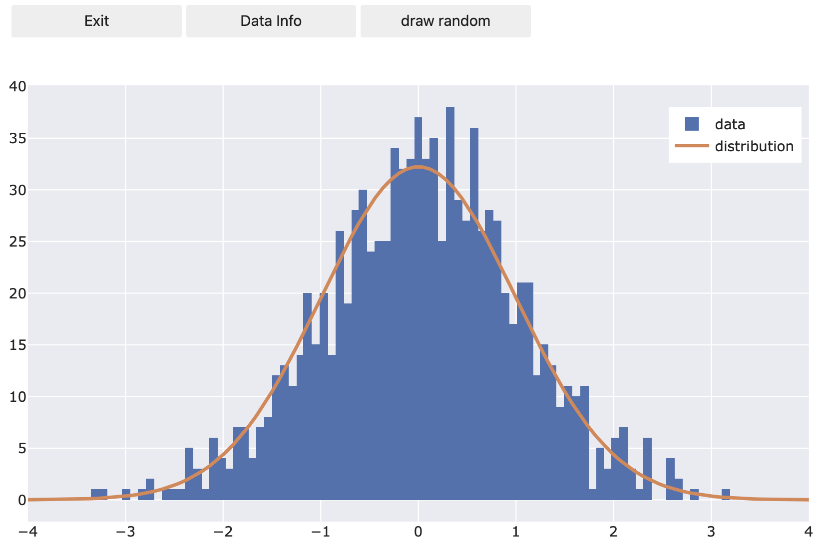
However, if you need something more involved, and especially if you want to click through data which are not events, you can create a callback function and a button on any figure widget (here shown with Histogram). Whenever you click ‘draw random’, a new set of random numbers will be drawn and the histogram will be re-populated.
import scipy as sp
import numpy as np
import cait.versatile as vai

N = 1000
bins = np.linspace(-4, 4, 100)

fig = vai.Histogram({
      "data": sp.stats.norm.rvs(size=N)
   },
   bins=bins,
   show_controls=True
)

def draw_random(*args, **kwargs):
   fig.update_histogram("data", data=sp.stats.norm.rvs(size=N), bins=bins)
   # needed for backend='mpl'
   # fig.update()

fig.add_line(x=bins, y=sp.stats.norm.pdf(bins)*N*np.diff(bins)[0], name="distribution")
fig.add_button("draw random", draw_random)
Normalize histograms with `plotly` backend:
Of course, you can produce normalized histograms easily with matplotlib but sometimes, for doing quick analysis, directly normalizing spectra with the interactive plotly backend can be useful. This can be achieved as follows:
some_bck_data, bck_record_time = ..., ...
some_57Co_data, 57Co_record_time = ..., ...

bins = np.linspace(0, 200, 1000)

spectrum = vai.Histogram(
   {
      "Co57": some_57Co_data,
      "bck": some_bck_data
   },
   bins=bins,
   xlabel="Energy (keV)",
   ylabel="counts/keV/h"
)

# This scales the histograms relative to the record time
spectrum.get_artist("Co57").histfunc = 'sum'
spectrum.get_artist("Co57").y = np.ones(len(some_57Co_data))/57Co_record_time
spectrum.get_artist("bck").histfunc = 'sum'
spectrum.get_artist("bck").y = np.ones(len(some_bck_data))/bck_record_time
Documentation
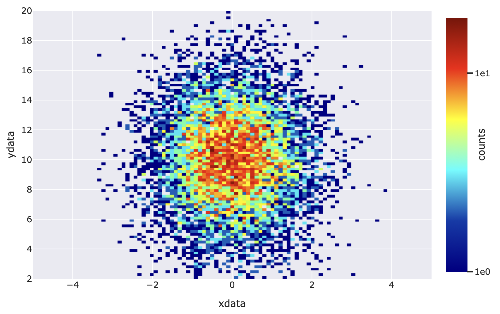
- class cait.versatile.Heatmap(x: List[float], y: List[float], bins: tuple | int = None, **kwargs)[source]
Bases:
ViewerPlot a Heatmap.
- Parameters:
x (List[float]) – The x-data to bin and plot.
y (List[float]) – The y-data to bin and plot.
bins (Union[None, int, tuple, np.ndarray], optional) – The binning data to use. If None, the binning is done automatically. An integer is interpreted as the desired total number of bins on both axes. You can also parse a tuple of the form (start, end, nbins) to bin the data between start and end into a total of nbins bins. A numpy array is interpreted as the desired bin edges. If you pass a tuple of length two, you can specify either of the aforementioned arguments for both axes separately.
kwargs (Any) – Keyword arguments for Viewer like ‘width’, ‘height’, ‘xrange’, ‘ylabel’.
Example:
import cait.versatile as vai
import numpy as np

xdata = np.random.normal(size=10000)
ydata = np.random.normal(loc=10, scale=3, size=10000)

vai.Heatmap(xdata,
            ydata,
            bins=(np.linspace(-5, 5, 100), np.linspace(2, 20, 100)),
            xlabel="xdata",
            ylabel="ydata",
            cscale="log",
            cmap="jet",
            clabel="counts")
- class cait.versatile.Histogram(data: List[float] | dict, bins: tuple | int = None, **kwargs)[source]
Bases:
ViewerPlot a Histogram.
- Parameters:
data (Union[List[float], dict]) – The data to bin and plot. You can either hand a list-like object (simple plotting of one histogram, or multiple histograms if multi-dimensional) or a dictionary whose keys are histogram names and whose values are again list-like objects (for each key a histogram is binned, plotted and a legend entry is created).
bins (Union[None, int, tuple], optional) – The binning data to use. If None, the binning is done automatically. An integer is interpreted as the desired total number of bins. You can also parse a tuple of the form (start, end, nbins) to bin the data between start and end into a total of nbins bins
kwargs (Any) – Keyword arguments for Viewer like ‘width’, ‘height’, ‘xrange’, ‘ylabel’.
Example:
import cait.versatile as vai

vai.Histogram([1,2,3])
vai.Histogram([[1,2,3], [5,6,7]])
vai.Histogram({"first hist": [1,2,3], "second hist": [0,1,2]})
vai.Histogram([1,2,3], bins=100, backend="mpl")
vai.Histogram([1,2,3], bins=(0,5,100), backend="mpl")
- class cait.versatile.Line(y: List[float] | List[List[float]] | dict, x: List[float] = None, **kwargs)[source]
Bases:
ViewerPlot a line graph.
- Parameters:
y (Union[List[float], dict]) – The y-data to plot. You can either hand a list-like object (simple plotting of one line, or multiple lines if multi-dimensional) or a dictionary whose keys are line names and whose values are again list-like objects (for each key a line is plotted and a legend entry is created. If the values in the dictionary are lists, the first entry is interpreted as x-values and the second as y-values).
x (List[float], optional) – The x-data to plot (for any lines for which x-data was not explicitly specified, see above). If None is specified, the y-data is plotted over the data index. Defaults to None.
kwargs (Any) – Keyword arguments for Viewer like ‘width’, ‘height’, ‘xrange’, ‘ylabel’.
Example:
import cait.versatile as vai

vai.Line([1,2,3])
vai.Line([[1,2,3], [5,6,7]])
vai.Line({"first line": [1,2,3], "second line with x data": [[0,1,2],[3,4,5]]})
vai.Line([1,2,3], x=[1,2,3], xrange=(-1, 4), backend="mpl")
- class cait.versatile.Preview(events: IteratorBaseClass, f: Callable = None, show_ev_time=True, **kwargs)[source]
Bases:
ViewerClass for inspecting the behavior of functions which were subclassed from
abstract_functions.FncBaseClass. Can also be used to display single events if no function is specified.- Parameters:
events (IteratorBaseClass) – An iterable of events. Can be e.g.
IteratorBaseClass, a 2dnumpy.ndarrayor a list of List[float].f (
cait.versatile.eventfunctions.functionbase.FncBaseClass) – The function to be inspected, already initialized with the values that should stay fixed throughout the inspection. Defaults to Unity (which means that just the events of the iterable will be displayed)show_ev_time (bool, optional) – If True, event number and time are shown in the y-axis label. Defaults to True.
kwargs (Any) – Keyword arguments for Viewer.
Example Preview:
import cait.versatile as vai

# Get events from mock data (and remove baseline)
it = vai.MockData().get_event_iterator().with_processing(vai.RemoveBaseline())[0]

# View pulses
vai.Preview(it)

# View pulses starting from index 37
vai.Preview(it[:, 37:])
- class cait.versatile.Scatter(y: List[float] | dict, x: List[float] = None, **kwargs)[source]
Bases:
ViewerPlot a scatter graph.
- Parameters:
y (Union[List[float], dict]) – The y-data to plot. You can either hand a list-like object (simple plotting of one scatter, or multiple scatters if multi-dimensional) or a dictionary whose keys are line names and whose values are again list-like objects (for each key a scatter is plotted and a legend entry is created. If the values in the dictionary are lists, the first entry is interpreted as x-values and the second as y-values).
x (List[float], optional) – The x-data to plot (for any lines for which x-data was not explicitly specified, see above). If None is specified, the y-data is plotted over the data index. Defaults to None.
kwargs (Any) – Keyword arguments for Viewer like ‘width’, ‘height’, ‘xrange’, ‘ylabel’.
Example:
import cait.versatile as vai

vai.Scatter([1,2,3])
vai.Scatter([[1,2,3], [5,6,7]])
vai.Scatter({"first scatter": [1,2,3], "second scatter with x data": [[0,1,2],[3,4,5]]})
vai.Scatter([1,2,3], x=[1,2,3], xrange=(-1, 4), backend="mpl")
- class cait.versatile.ScatterPreview(x: List[float], y: List[float], ev_it: IteratorBaseClass, f: Callable = None, **kwargs)[source]
Bases:
objectScatter plot with event preview.
Clicking on scatter data displays the corresponding event in a separate figure (and the effect a function has on it, if provided). You can select scatter points and delete them from the plot using the “cut selected” button. The currently selected data indices and events are furthermore accessible through the respective methods.
- Parameters:
x (List[float]) – x-data for the scatter plot.
y (List[float]) – y-data for the scatter plot.
ev_it (IteratorBaseClass) – Event iterator corresponding to the x-y data (if a point (x,y) is clicked, the corresponding event from the iterator is displayed).
f (
cait.versatile.eventfunctions.functionbase.FncBaseClass) – The function to be inspected, already initialized with the values that should stay fixed throughout the inspection. Defaults to Unity (which means that just the events of the iterable will be displayed)kwargs (dict, optional) – Keyword arguments for the cait.versatile.Viewer class.
- property selected_events
Returs an iterator of events currently selected in the scatter plot.
- property selected_inds
Returns the indices (of the original x-y data) currently selected in the scatter plot.
- class cait.versatile.StreamViewer(*args: StreamBaseClass | str | list, keys: str | List[str] = None, n_points: int = 10000, downsample_factor: int = 100, mark_timestamps: List[int] | dict = None, of: ndarray = None, start_timestamp: int = None, subtract_bl: bool = True, **kwargs)[source]
Bases:
ViewerClass to view stream data, i.e. for example the contents of a binary file as produced by vdaq2.
- Parameters:
args (Union[StreamBaseClass, str, list]) – Either an existing Stream instance or both ‘hardware’ (str) and file(s) (str or list of str).
keys (Union[str, List[str]]) – The keys of the stream to display. If none are specified, all available keys are plotted. Defaults to None.
n_points (int, optional) – The number of data points that should be simultaneously displayed in the stream viewer. A large number can impact performance. Note that the number of points that are displayed are irrelevant of the downsampling factor (see below), i.e. the viewer will always display n_points points.
downsample_factor (int, optional) – This many samples are skipped in the data when plotting it. A higher number increases performance but lowers the level of detail in the data.
mark_timestamps (Union[List[int], int], optional) – A list of timestamps to be shown on top of the stream (e.g. to check trigger timestamps). Can also be a dictionary of lists, in which case they keys of the dictionary are used as legend entries.
of (np.ndarray, optional) – If provided, a preview of the optimum filtered stream is shown. Only works for single-channel filters in which case also the ‘keys’ argument has to be set to exactly one channel (the one you want to filter).
start_timestamp (int, optional) – The timestamp at which to start the StreamViewer. Defaults to the first timestamp in the stream.
subtract_bl (bool, optional) – If set to True, the median of the currently displayed channels are subtracted before plotting. Defaults to True.
kwargs (Any) – Keyword arguments for Viewer.
# Usage 1
s = Stream(hardware="vdaq2", src="path/to/file.bin")
StreamViewer(s)

# Usage 2
StreamViewer("vdaq2", "path/to/file.bin", key="ADC1")
- class cait.versatile.Viewer(data=None, backend='auto', xlabel: str = None, ylabel: str = None, clabel: str = None, xscale: str = None, yscale: str = None, cscale: str = None, xrange: tuple = None, yrange: tuple = None, crange: tuple = None, cmap: str = None, **kwargs)[source]
Bases:
objectClass for plotting data given a dictionary of instructions (see below). For convenience, the axis properties can alternatively be set as keyword arguments, too, and will override the axis properties contained in the dictionary.
- Parameters:
data (dict, optional) – Data dictionary containing line/scatter/axes information (see below), defaults to None
backend (str, optional) – The backend to use for the plot. Either of [‘plotly’, ‘mpl’, ‘uniplot’, ‘auto’], i.e. plotly, matplotlib or uniplot (command line based), defaults to ‘auto’ which uses ‘plotly’ in notebooks and ‘uniplot’ otherwise.
xlabel (str, optional) – x-label for the plot.
ylabel (str, optional) – y-label for the plot.
clabel (str, optional) – Label for the colour axis of the plot (if applicable).
xscale (str, optional) – x-scale for the plot. Either of [‘linear’, ‘log’], defaults to ‘linear’.
yscale (str, optional) – y-scale for the plot. Either of [‘linear’, ‘log’], defaults to ‘linear’.
cscale (str, optional) – Scale for the colour axis of the plot (if applicable). Either of [‘linear’, ‘log’], defaults to ‘linear’.
xrange (tuple, optional) – x-range for the plot. A tuple of (xmin, xmax), defaults to None, i.e. auto-scaling.
yrange (tuple, optional) – y-range for the plot. A tuple of (ymin, ymax), defaults to None, i.e. auto-scaling.
crange (tuple, optional) – Range for colour axis of the plot (if applicable). A tuple of (cmin, cmax), defaults to None, i.e. auto-scaling.
cmap (str, optional) – Colour map to use (if applicable). If None, the default colour map for the chosen template of the chosen backend will be used.
template (str, optional) – Valid backend theme. For plotly either of [‘ggplot2’, ‘seaborn’, ‘simple_white’, ‘plotly’, ‘plotly_white’, ‘plotly_dark’, ‘presentation’, ‘xgridoff’, ‘ygridoff’, ‘gridon’, ‘none’], for mpl either of [‘default’, ‘classic’, ‘Solarize_Light2’, ‘_classic_test_patch’, ‘_mpl-gallery’, ‘_mpl-gallery-nogrid’, ‘bmh’, ‘classic’, ‘dark_background’, ‘fast’, ‘fivethirtyeight’, ‘ggplot’, ‘grayscale’, ‘seaborn-v0_8’, ‘seaborn-v0_8-bright’, ‘seaborn-v0_8-colorblind’, ‘seaborn-v0_8-dark’, ‘seaborn-v0_8-dark-palette’, ‘seaborn-v0_8-darkgrid’, ‘seaborn-v0_8-deep’, ‘seaborn-v0_8-muted’, ‘seaborn-v0_8-notebook’, ‘seaborn-v0_8-paper’, ‘seaborn-v0_8-pastel’, ‘seaborn-v0_8-poster’, ‘seaborn-v0_8-talk’, ‘seaborn-v0_8-ticks’, ‘seaborn-v0_8-white’, ‘seaborn-v0_8-whitegrid’, ‘tableau-colorblind10’], defaults to ‘ggplot2’ for backend=plotly and to ‘seaborn’ for backend=mpl. template has no effect for backend ‘uniplot’.
height (int, optional) – Figure height, defaults to 500 for backend=plotly, 3 for backend=mpl and 17 for backend=uniplot
width (int, optional) – Figure width, defaults to 700 for backend=plotly, 5 for backend=mpl and 60 for backend=uniplot
show_controls (bool) – Show button controls to interact with the figure. The available buttons depend on the plotting backend. Defaults to False
Convention for ‘data’ Dictionary:
data = {
        "line": {
            "line1": [x_data1, y_data1],
            "line2": [x_data2, y_data2]
            },
        "scatter": {
            "scatter1": [x_data1, y_data1],
            "scatter2": [x_data2, y_data2]
            },
        "histogram": {
            "hist1": [bin_data1, hist_data1],
            "hist2": [bin_data2, hist_data2]
            },
        "heatmap": {
            "heat1": [bin_data1, xdata1, ydata1],
            "heat2": [bin_data2, xdata2, ydata2]
            },
        "axes": {
            "xaxis": {
                "label": "xlabel",
                "scale": "linear",
                "range": (0, 10)
                },
            "yaxis": {
                "label": "ylabel",
                "scale": "log",
                "range": (0, 10)
                },
            "caxis": {
                "label": "clabel",
                "scale": "linear",
                "range": (0, 10),
                "cmap": "plasma"
                }
            }
        }
- add_button(text: str, callback: Callable, tooltip: str = None, where: int = -1, key: str = None)[source]
Add a button and callback to be activated by clicking it to the figure. Note that for this, you need to set show_controls=True.
- Parameters:
text (str) – The text on the button.
callback (Callable) – The function to call when it is pressed.
tooltip (str, optional) – The tooltip for the button.
where (int, optional) – The spot in the list of buttons where to place the new button. Defaults to -1, i.e. append to the end of the list.
key (str, optional) – This is relevant for backend=’uniplot’ only. With that backend, there are no buttons, so the ‘button’ is pressed by pressing the specified key.
- add_heatmap(x: List[float], y: List[float], bins: int | tuple | list, name: str = None)[source]
Add a heatmap to the figure. If a name is provided, it is registered and can later be updated.
- Parameters:
x (List[float]) – The x-data to bin and plot.
y (List[float]) – The y-data to bin and plot.
bins (Union[None, int, tuple, np.ndarray], optional) – The binning data to use. If None, the binning is done automatically. An integer is interpreted as the desired total number of bins on both axes. You can also parse a tuple of the form (start, end, nbins) to bin the data between start and end into a total of nbins bins. A numpy array is interpreted as the desired bin edges. If you pass a tuple of length two, you can specify either of the aforementioned arguments for both axes separately.
name (str, optional) – The name of the heatmap in the legend and its unique identifier for later updates. If None, the heatmap does not show up in the legend and is not registered for later update.
- add_histogram(bins: int | tuple | list, data: List[float], name: str = None)[source]
Add a histogram to the figure. If a name is provided, it is registered and can later be updated.
- Parameters:
bins (Union[None, int, tuple], optional) – The binning data to use. If None, the binning is done automatically. An integer is interpreted as the desired total number of bins. You can also parse a tuple of the form (start, end, nbins) to bin the data between start and end into a total of nbins bins
data (List[float]) – The data to bin.
name (str, optional) – The name of the histogram in the legend and its unique identifier for later updates. If None, the histogram does not show up in the legend and is not registered for later update.
- add_line(x: List[float], y: List[float], name: str = None)[source]
Add a line plot to the figure. If a name is provided, it is registered and can later be updated.
- Parameters:
x (List[float]) – The x-data of the line.
y (List[float]) – The y-data of the line.
name (str, optional) – The name of the line in the legend and its unique identifier for later updates. If None, the line does not show up in the legend and is not registered for later update.
- add_scatter(x: List[float], y: List[float], name: str = None)[source]
Add a scatter plot to the figure. If a name is provided, it is registered and can later be updated.
- Parameters:
x (List[float]) – The x-data of the scatter.
y (List[float]) – The y-data of the scatter.
name (str, optional) – The name of the scatter in the legend and its unique identifier for later updates. If None, the scatter does not show up in the legend and is not registered for later update.
- property backend
Return the backend currently in use.
- get_artist(name: str)[source]
Returns the artist object (e.g. plotly Scatter or matplotlib Line) of the plot. Can be used to further manipulate the plot. References on available functions can be found online, e.g. matplotlib lines (https://matplotlib.org/stable/api/_as_gen/matplotlib.lines.Line2D.html#matplotlib.lines.Line2D) and plotly scatters (https://plotly.com/python-api-reference/generated/plotly.graph_objects.Scatter.html).
Example:
import cait.versatile as vai

# PLOTLY:
plot = vai.Viewer({"line": {"line1": [[1, 2, 3, 4], [1, 4, 9, 16]]}}, backend="plotly")
plot.get_artist("line1").line.dash = "dash"

# MATPLOTLIB:
plot = vai.Viewer({"line": {"line1": [[1, 2, 3, 4], [1, 4, 9, 16]]}}, backend="mpl")
plot.get_artist("line1").set_linestyle("--")
plot.update() # required for matplotlib backend

# works analogously for vai.Line({"line1": [[1, 2, 3, 4], [1, 4, 9, 16]]})
# and other higher-level plotting functions
- get_figure()[source]
Returns the figure object of the plot. Can be used to further manipulate the plot.
- plot(data: dict)[source]
Plot data stored in dictionary.
- Parameters:
data (dict) – The data dictionary to plot (see
Viewerfor details on how the dictionary needs to be structured)
- set_clabel(clabel: str)[source]
Set the colour axis label (if applicable).
- Parameters:
clabel (str) – colour axis label
- set_crange(crange: tuple)[source]
Set the colour axis range (if applicable).
- Parameters:
crange (tuple) – Colour axis range. A tuple of (ymin, ymax)
- set_cscale(cscale: str)[source]
Set the scale of colour axis (if applicable). Either linear or logarithmic.
- Parameters:
cscale (str) – Colour axis scale. Either of [“linear”, “log”]
- set_xrange(xrange: tuple)[source]
Set the x-range of the axis.
- Parameters:
xrange (tuple) – x-range. A tuple of (xmin, xmax)
- set_xscale(xscale: str)[source]
Set the x-scale of the axis. Either linear or logarithmic.
- Parameters:
xscale (str) – x-scale. Either of [“linear”, “log”]
- set_yrange(yrange: tuple)[source]
Set the y-range of the axis.
- Parameters:
yrange (tuple) – y-range. A tuple of (ymin, ymax)
- set_yscale(yscale: str)[source]
Set the y-scale of the axis. Either linear or logarithmic.
- Parameters:
yscale (str) – y-scale. Either of [“linear”, “log”]
- show_legend(show: bool = True)[source]
Show/hide legend.
- Parameters:
show (bool) – If True, legend is shown. If False, legend is hidden.
- update_heatmap(name: str, x: List[float], y: List[float], bins: int | tuple | list)[source]
Update the heatmap called name with data x, y and bins bins. See func:add_heatmap for an explanation of the arguments.
- update_histogram(name: str, bins: int | tuple | list, data: List[float])[source]
Update the histogram called name with data data and bins bins. See func:add_histogram for an explanation of the arguments.
- update_line(name: str, x: List[float], y: List[float])[source]
Update the line called name with data x and y. See func:add_line for an explanation of the arguments.