Creating SEV, NPS, OF
Author: Àfrica González Pedraza, Danaé Valdenaire
Created: May 19th, 2026
Last updated: June 28th, 2026 by Philipp Schreiner
This tutorial will teach you how to:
Apply quality cuts
Create the Standard Event (SEV), which is the typical pulse shape of your signal in the detector
Generate the Noise Power Spectrum (NPS), which describes the typical noise frequencies found in your data
Build the Optimum Filter (OF), which is a frequency filter that detects typical signal frequencies and suppresses noise
Estimate the baseline resolution of the detector
The exact workflow for building these objects is a matter of preference. We present two main approaches but you can customize the workflow or combine the two methods.
import os
import numpy as np
import scipy as sp
import cait as ai
import cait.versatile as vai
First, you need (mock) data
Before starting the work, we need to either load the DataHandler from before, or create it (if you skipped the previous tutorials). If you are not familiar with the DataHandler, we really advice you to have a look at the Triggering stream data tutorial for an explanation on how the data was created and Interacting with HDF5 files to get an introduction on how to work with it.
# Generate mockdata (if you skipped the triggering tutorial)
fdirh5 = "tutorial_output"
hdf5_name = "my_first_trigger"
os.makedirs(fdirh5, exist_ok=True)
record_length = 2**14
trigger_config = {
"trigger_channels": ["Ch0"],
"passive_channels": ["Ch1"],
"testpulse_channels": ["TP0", "TP1"],
"controlpulses_above": [9., 9.],
"f_noise": 1000,
"copy_events": True,
}
n_channels = len(trigger_config["trigger_channels"]) + len(trigger_config["passive_channels"])
stream = vai.MockStream(seed=137, rate_Hz=2)
# Create DataHandler, trigger and compute main parameters (if you skipped the triggering tutorial)
dh = ai.DataHandler(
record_length=record_length,
nmbr_channels=n_channels,
sample_frequency=stream.sample_frequency,
)
dh.set_filepath(path_h5="tutorial_output", fname="my_first_trigger", appendix=False)
dh.init_empty()
dh.trigger_zscore(stream, **trigger_config)
for group in ["events", "testpulses", "noise", "controlpulses"]:
dh.cmp(group)
If you already have the file ready, you can instantiate the DataHandler like so:
# Create DataHandler instance
dh = ai.DataHandler(
record_length=record_length,
nmbr_channels=n_channels,
sample_frequency=stream.sample_frequency,
)
# Set the path to the desired HDF5 file
dh.set_filepath(path_h5="tutorial_output", fname="my_first_trigger", appendix=False)
1. Quality cuts, SEV cuts and SEV creation
The first step of the data analysis is to clean the data. This means: discard artifacts (such as flux quantum losses, SQUID resets, voltage spikes, …) via quality cuts, and discarding events recorded while the detector temperature was unstable (stability cut).
All events → reject unstable time periods → reject artifacts/apply quality cuts → clean events
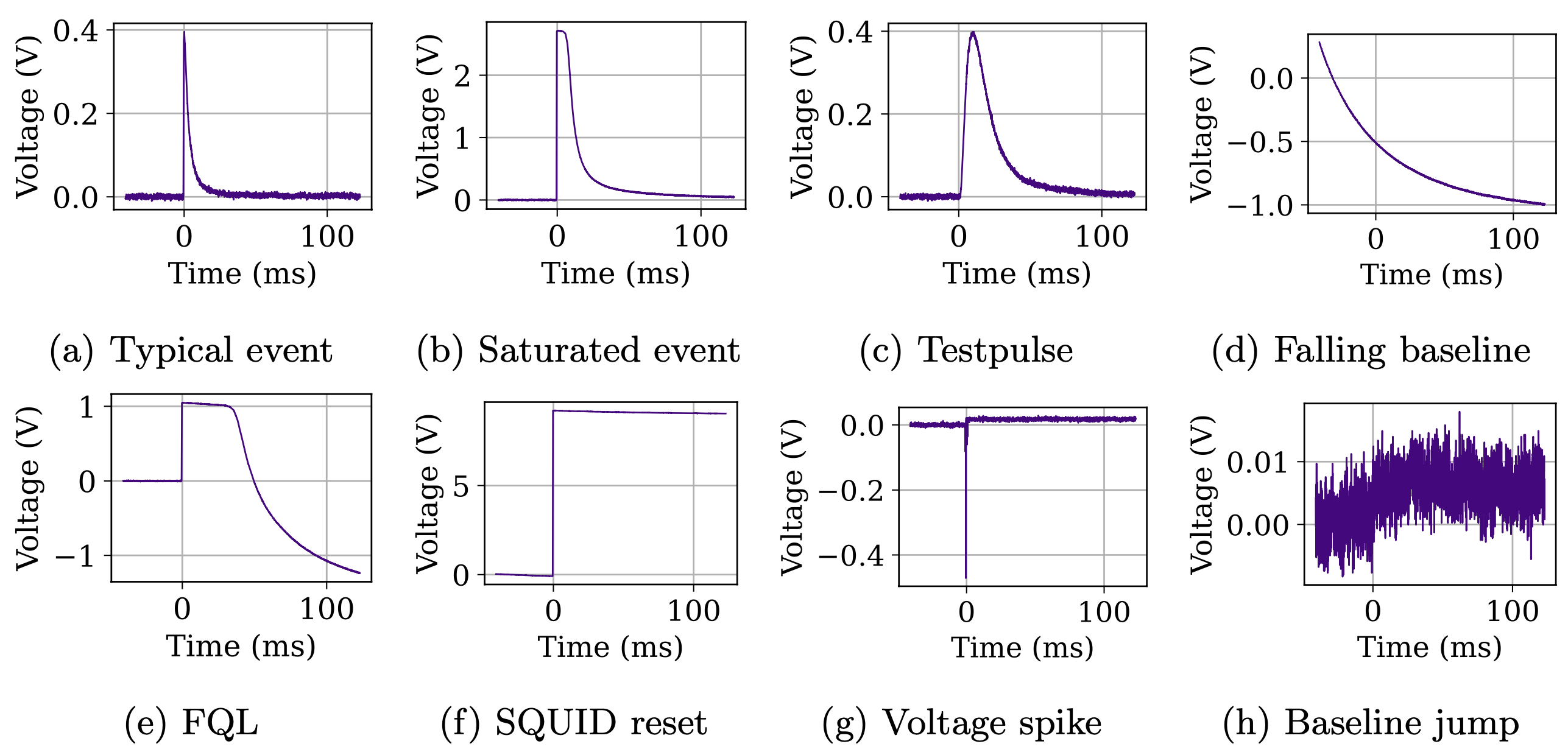
The second step is to create the Standard Event (SEV) by selecting high-quality events that exhibit the typical pulse shapes of the signal. These events will later be averaged and fitted. The averaged pulse shape is the SEV.
Clean events → apply strict SEV cuts → SEV events → average → SEV
For the SEV cut event selection, start with the events surviving the stability cut and then perform strict cuts by inspecting several parameters.
Tip
For the SEV creation, the number of events surviving the cuts is less relevant. The most important aspect is that the remaining events:
only contain one pulse (no pile-ups),
are in the linear region of the detector (no saturated events),
start and end in a flat baseline (i.e. discard events starting from a falling baseline),
have very similar onset values (prevent the SEV from washing out during the averaging process).
Stability cut
The first thing you should always check is whether your detector was stable or not. For that, you use the heights of the controlpulses over time. Plot them and decide where you want to cut events due to the detector being unstable.
h = dh["controlpulses/hours"]
scat = vai.Scatter(
{
"Phonon channel": dh["controlpulses/pulse_height", 0],
"Light channel": dh["controlpulses/pulse_height", 1],
},
x=h,
xlabel="Time (h)",
ylabel="Controlpulse height (V)",
backend="plotly",
)
linex = [np.min(h), np.max(h), None, np.min(h), np.max(h)]
ph_bounds = (0.185, 0.190)
l_bounds = (0.0184, 0.0190)
scat.add_line(x=linex, y=[ph_bounds[0]]*2 + [None] + [ph_bounds[1]]*2, name="Cut outside (phonon)")
scat.add_line(x=linex, y=[l_bounds[0]]*2 + [None] + [l_bounds[1]]*2, name="Cut outside (light)")
Note that here, we just did this by eye. If you want to be diligent, you would plot the distributions of the pulse heights and define some quantile (e.g. 95%) and cut there.
Once you have the upper and lower stability bounds (for each channel individually), you call the controlpulse stability function:
for g in ["events", "testpulses", "noise"]:
dh.calc_controlpulse_stability(channel=0, group=g, lb=ph_bounds[0], ub=ph_bounds[1])
dh.calc_controlpulse_stability(channel=1, group=g, lb=l_bounds[0], ub=l_bounds[1])
This results in a flag controlpulse_stability in each group in the DataHandler. It is True for events during stable time intervals.
Quality Cuts
Next, we want to reject artefacts. The exact workflow to do so is a matter of preference. We present the two main approaches but you can individualize the workflow and/or combine the two methods.
Method 1: VizTool: Creates interactive 2D and 3D plots to visualize any parameter stored in the DataHandler and included in a datasets dictionary.
The function allows you to select events directly in the plots and visualize their individual shapes. By changing the ‘group’ argument, you can also visualize testpulses and
noise. The event selection can be later rejected, included in the DataHandler or averaged to identify the mean pulse shape.
Method 2: cait.versatile: Creates individual 2D and 3D plots, where the event selection occurs with logical expressions. The visualization of the
selected events is done separately.
For beginners, Method 1 is more practical for getting to know the data and learing how different types of pulses are distributed in the 2D plots.
Advantages of Method 1 compared to Method 2:
Faster identification and selection of populations.
Faster saving of the selection to the
DataHandler.Faster visualization of the mean pulse shape.
Ideal for beginners to explore and play around with the data and pulse shape characteristics.
Disadvantages of Method 1 compared to Method 2:
No quantification: Events are selected manually by hand, whereas Method 2 uses precise, logical expressions.
Less traceability: The boundaries of the cuts and cut parameters are not saved or visible afterwards, whereas Method 2 hardcodes the cut limits and parameters, providing a clear overview.
Large amount of data must be downsampled; otherwise, the
VizToolperformance drops significantly or might even crash your browser.
Note
We illustrate the procedure by building the phonon channel SEV (channel 0) only. If you have several channels, the SEV must be created for each channel separately.
Method 1 - Using VizTool: Interactive plotting
# Define channel number to look at (change accordingly)
ch = 0
# Define datasets to be visualized (add more if you want).
# dh.content() to see which parameter are available.
datasets = {
"Time (h)": ["hours", None, None],
"Pulse Height Phonon (V)": ["pulse_height", ch, None],
"Rise Time Phonon (ms)": ["rise_time", ch, None],
"Decay Time Phonon (ms)": ["decay_time", ch, None],
"Onset Phonon (ms)": ["onset", ch, None],
"Slope Phonon (V)": ["baseline_slope", ch, None],
"Variance Phonon (V^2)": ["variance", ch, None],
}
# Open the interactive tool
viz = ai.VizTool(
datahandler=dh,
group="events", # or group="testpulses", group="noise"...
datasets=datasets,
bins=100,
)
viz.show()
# NOTE THAT THE WIDGET IS NOT INTERACTIVE ON THE DOCS PAGE
The standard workflow now goes as follows:
Select x- and y-value to be plotted.
Tip
Guidelines for beginners
x-axis: Events are typically plotted against the pulse height (first approximation of the energy). In some cases, it is also useful to plot against time to identify if a certain feature is equally distributed throughout the measurement or concentrated in a specific time period.
y-axis: Try experimenting with all the parameters. Observe how the distributions change and how different populations arise in the different parameters (see tips below)
Density plots: prevent overplotting in large datasets by using continuous shading to reveal the true concentration and patterns of data where a scatter plot would just show a solid, unreadable blob of dots.
Color axis: Use a third parameter as a color axis to discover the interplay between the parameters.
In the top right corner, click ‘Box Select’ (or lasso). Select the region on the graph that contains the events you want to study.
Below the plot, check how many events you have selected, and scroll through the events to recognize their characteristics.
3.1) Storing a selection (flag): If you want to store a flag containing the events of the selectied region in the
DataHandler, type your desired name for the selection in the text box, pressENTER, and click ‘Save Selected’. Saved cuts:are stored even if the cell is recompiled,
can be individually analyzed/plotted later,
can be overwritten by using the same name.
Example: If you are only interested in events with a decay time parameter of 3.1 ms, select those events, type in the box ‘decay_time_cut’, press
ENTER, and click ‘Save Selected’.
Note
We recommend to save the events that survive each cut to keep track of the cut process and to analyze them individually later. Otherwise, individual cuts will not be preserved.
Give each cut a descriptive name. We recommend keeping record (on paper or markdown cell) of what each cut does (e.g.,
decay_time_cutselects events with a decay time of 3.1 ms).You can also use the
VizToolto only decide on your cuts, and not apply them interactively but rather by writing them down as follows (without using the ‘Save Selected’ to directly store it in theDataHandler):
# Writing down the actual cuts makes the analysis reproducible
quality_cuts_viztool = ai.cuts.LogicalCut()
quality_cuts_viztool.add_condition(dh["events/controlpulse_stability", 0])
quality_cuts_viztool.add_condition(( dh["events/pulse_height", 0] >= -0.035 )*( dh["events/pulse_height", 0] <= 0.038 ))
quality_cuts_viztool.add_condition(np.abs(dh["events/baseline_slope", 0]) < 1e-6)
quality_cuts_viztool.add_condition(dh["events/variance", 0] < 0.0012)
quality_cuts_viztool.add_condition(( dh["events/decay_time", 0] > 8 ) * ( dh["events/decay_time", 0] < 12 ))
# Now don't forget to save your cuts.
# The best way is to store them directly in your DataHandler:
dh.apply_logical_cut(
cut_flag=quality_cuts_viztool.get_flag(),
naming="quality_cuts_viztool",
channel=0,
type="events",
delete_old=True,
)
3.2) Cutting out a region: To remove a region from the current view, click ‘Cut Selected’ (only once!). This removes the events from the VizTool interface but does not alter anything in the DataHandler.
Warning
Once events are removed from the view, they cannot be recovered without starting over or reloading from a previously saved cut.
Clicking ‘Cut Selected’ more than once will remove all remaining events from the
VizTool.To start over from the beginning, re-execute the
viz = ...cell.To reload a previously saved cut and/or to downsample the data, uncomment the corresponding lines below.
3.3) Calculating the average pulse shape: Click ‘Calc SEV’ and then observe the event visualization window. This tool is only for visualization (does not store anything in the DataHandler) and should always be used to ensure the SEV does not feature distortions. If the shape looks clean, scroll through the selected events to verify there are no hidden artifacts and then save the cut as ‘sev_cut’ (following the steps in 3.1).
3.4) Create a SEV cut for each channel individually.
Tips for beginners:
Understand the parameters. How does each parameter describe which part/feature of the pulse? See how the parameters are defined relative to the ‘anchor points’ shown below in the main parameters documentation.
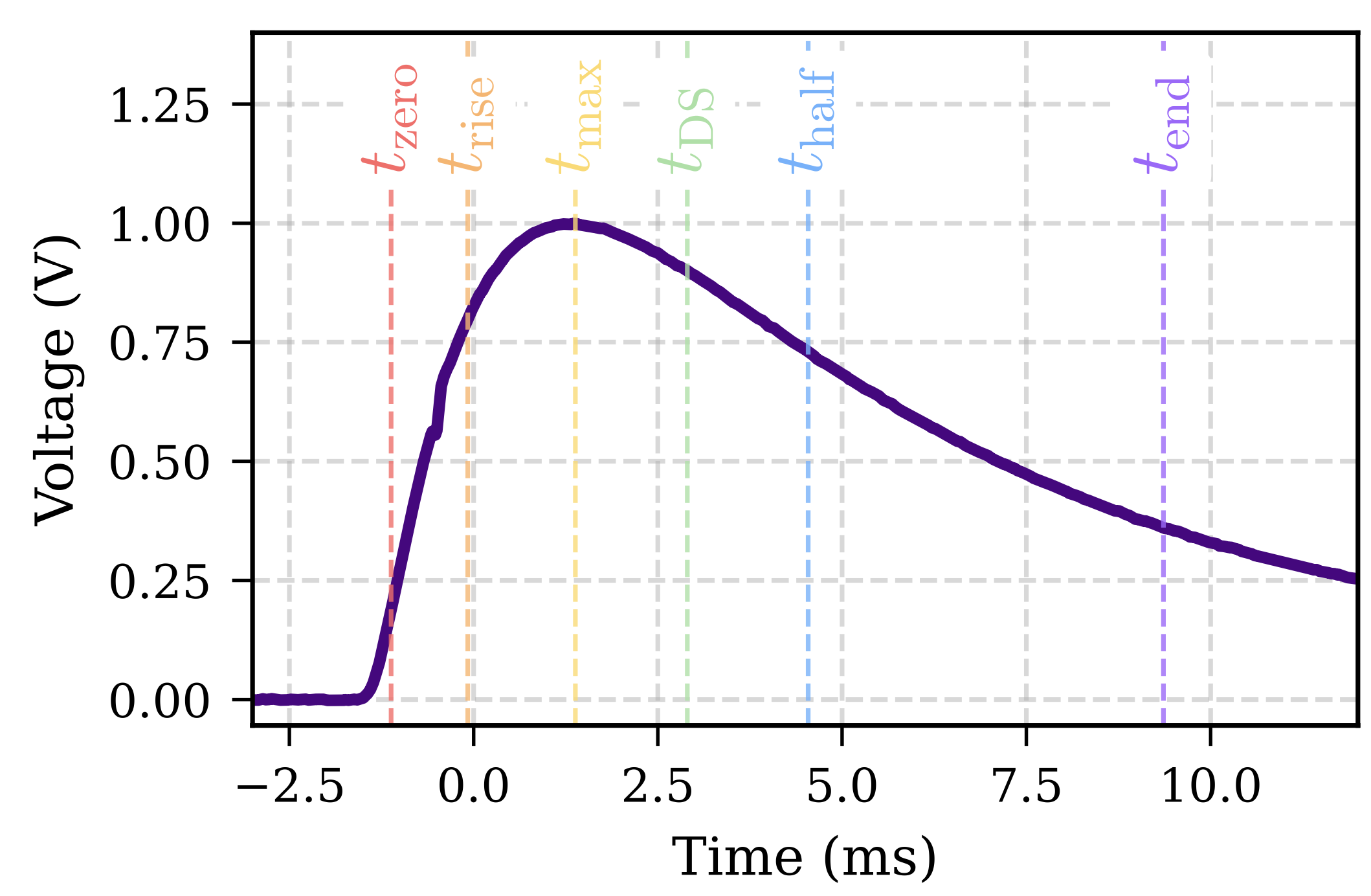
Explore the data: Once you know how each parameter is calculated, play around with the plots and select different regions of the spectrum. This will help you to get familiar with how specific types of pulses correspond to certain parameter values.
Choose relevant parameters based on the pulse features you want to discard: For example: To isolate SQUID resets (characterized by a step-like jump of O(~8 V)), the pulse height (maximum of the trace after a moving average) or the slope (mean of the last fifty samples minus the mean of the first fifty samples) are highly effective parameters for discriminating SQUID resets from true signal events. Always try to find the specific parameters that best capture the unique characteristics of the events you wish to reject. There is no unique combination of parameters or cuts; different parameter sets can yield the same result, and each dataset will require its own tailored cuts.
As a side note, you can use set_idx to only show a subset of points in the VizTool as shown below:
# Visualize a cut saved previously
# viz.set_idx(np.nonzero(dh.get('events', 'decay_time_cut'))[1])
# Downsample events or noise
# viz.set_idx(np.arange(0, n_events, downsample_factor))
# Downsample testpulses randomly
# viz.set_idx(np.random.choice(n_testpulses, n_testpulses//downsample_factor, replace=False))
# Downsample a cut saved previously
# viz.set_idx(np.nonzero(dh.get('events', 'some_cut'))[1])[::downsample_factor]
Method 2 - Using cait.versatile: Histograms and logical expressions
cait.versatile offers various plotting function to visualise your data in an interactive way. For more information about the plotting functions available, click here.
The most useful are probably histograms. Below, we will show how a workflow for defining cuts using histograms might look like:
# We select a specific range of pulse heights (often done for a calibration source)
ph_bounds = (0.035, 0.04)
vai.Histogram(
dh["events/pulse_height", 0],
bins=500,
xlabel="Pulse height (V)",
backend="plotly",
).add_line(
x=[ph_bounds[0], ph_bounds[0], None, ph_bounds[1], ph_bounds[1]],
y=[0, 500, None, 0, 500],
name="Cut outside",
);
# We make sure that the pulse onsets are all similar (important for SEV averaging).
# For the SEV creation, you have to be a bit aggressive here.
os_bounds = (-0.645, -0.625)
vai.Histogram(
dh["events/onset", 0],
bins=(-7, 2, 600),
xlabel="Onset (V)",
backend="plotly",
).add_line(
x=[os_bounds[0], os_bounds[0], None, os_bounds[1], os_bounds[1]],
y=[0, 500, None, 0, 500],
name="Cut outside",
);
# Using the decay time (or rise time), different pulse shapes
# (with different physical origin) can often be distinguished
dt_bounds = (8, 12)
vai.Histogram(
dh["events/decay_time", 0],
bins=800,
xlabel="Rise time (ms)",
backend="plotly",
).add_line(
x=[dt_bounds[0], dt_bounds[0], None, dt_bounds[1], dt_bounds[1]],
y=[0, 500, None, 0, 500],
name="Cut outside",
);
# If you need a 2D plot, you can use Scatter (or ScatterPreview) or Heatmap
vai.ScatterPreview(
x=dh["events/pulse_height", 0],
y=dh["events/rise_time", 0],
ev_it=dh.get_event_iterator("events", 0),
xlabel="Pulse height (V)",
ylabel="Rise time (ms)",
xrange=(0, 0.2),
yrange=(-0.2, 1),
width=500,
backend="plotly",
);
vai.Heatmap(
x=dh["events/pulse_height", 0],
y=dh["events/rise_time", 0],
xlabel="Pulse height (V)",
ylabel="Rise time (ms)",
xrange=(0, 0.2),
yrange=(-0.2, 1),
bins=((0, 0.2, 100), (-0.2, 1, 100)),
cmap="ice",
cscale="log",
backend="plotly",
);
After refining the value of your cuts, you can save them as follow \(\downarrow\)
quality_cuts = ai.cuts.LogicalCut()
quality_cuts.add_condition(dh["events/controlpulse_stability", 0])
quality_cuts.add_condition((dh["events/onset", 0]>os_bounds[0])*(dh["events/onset", 0]<os_bounds[1]))
quality_cuts.add_condition((dh["events/decay_time", 0]>dt_bounds[0])*(dh["events/decay_time", 0]<dt_bounds[1]))
quality_cuts.add_condition((dh["events/pulse_height", 0]>ph_bounds[0])*(dh["events/pulse_height", 0]>ph_bounds[1]))
print(f"Survived: {quality_cuts.counts()}/{quality_cuts.total()}, {100*quality_cuts.counts()/quality_cuts.total():.2f} %")
Survived: 252/5318, 4.74 %
Tip
To see all functionalities available with LogicalCut, you can write press TAB after writing quality_cuts. The one you will need most is .get_flag().
Then, you might want to see how the remaining events look like:
# Visualize the events that survive your cuts
vai.Preview(
dh.get_event_iterator(
"events",
channel=0,
flag=quality_cuts.get_flag()
).with_processing(
vai.RemoveBaseline()
),
backend="plotly",
);
Looking at the events, it looks like there are no artefacts remaining (all pulses look like particle events). However, there is a few pile-up still in our data. Usually, pile-up are easily removed as shown below when creating the SEV.
Finally, we can again save the quality cuts in the DataHandler:
dh.apply_logical_cut(
cut_flag=quality_cuts.get_flag(),
naming="quality_cuts",
channel=0,
type="events",
delete_old=True,
)
You should see now the quality cuts in the event group \(\downarrow\)
dh.content("events")
events
baseline_difference (2, 5318) float64
baseline_offset (2, 5318) float64
baseline_slope (2, 5318) float64
controlpulse_stability (2, 5318) bool
decay_time (2, 5318) float64
decay_time_CAT (2, 5318) float64
event (2, 5318, 16384) float32
hours (5318,) float64
integral (2, 5318) float64
max_deriv (2, 5318) float64
max_deriv_index (2, 5318) int64
maximum (2, 5318) float64
min_deriv (2, 5318) float64
min_deriv_index (2, 5318) int64
onset (2, 5318) float64
onset_CAT (2, 5318) float64
peak_position (2, 5318) float64
pulse_height (2, 5318) float64
quality_cuts (2, 5318) bool
quality_cuts_viztool (2, 5318) bool
rise_time (2, 5318) float64
rise_time_CAT (2, 5318) float64
rms (2, 5318) float64
time_mus (5318,) int32
time_s (5318,) int32
|timestamps (5318,)
trigger_flag (2, 5318) bool
trigger_phs (2, 5318) float32
trigger_timestamps (2, 5318) int64
variance (2, 5318) float64
Tip
If you made a mistake or you are not happy with the selection, you can do dh.drop("events", "quality_cuts") and start over.
Notice that with this method (as compared to the one with the VizTool), you can just re-run all the cells to see exactly which cuts you applied and possibly also change them if needed.
Creating a SEV for particle events
A standard event is a template that should describe the shape of your pulses in the linear regime of your detector. To create it, we need to select the best-looking pulses we have in our dataset and then average them. It’s pretty easy to do with cait, we just have to follow the steps we just described. First we define our quality cuts, then we apply them on the event group and when we are happy with how it looks, we save the SEV object.
First, we need the iterator containing our clean events:
# Load quality_cuts from DataHandler
quality_cuts = dh["events/quality_cuts", 0]
# Construct an event iterator
sev_events = dh.get_event_iterator(group="events", channel=0, flag=quality_cuts)
We can already define a SEV by averaging those events as a first draft and visualize it.
sev = vai.SEV(sev_events)
sev.show(backend="plotly");
Then, we can fit this template to all the pulses in the iterator and use the fit’s RMS values to filter out “bad events”.
See also
Have a look at the Reconstructing the pulse amplitude tutorial to learn more about the template fit.
*_, rms = vai.apply(vai.TemplateFit(sev, bl_poly_order=1), sev_events)
We can use the function ScatterPreview to plot the RMS of the fit. This function allows you to display the event corresponding to each point of the scatter plot.
vai.ScatterPreview(
y=rms,
x=np.arange(len(rms)),
ev_it=sev_events.with_processing(vai.RemoveBaseline()),
xlabel="Data point index",
ylabel="Fit RMS (V)",
width=500,
backend="plotly",
).scatter.add_line(x=[0, len(rms)], y=[0.0051]*2);
We see that there are multiple populations in the plot. By clicking on the events with high RMS, we find that they are due to pile-up. We can exclude the pile-ups by selecting an upper limit on the RMS:
sev_events = sev_events[:, rms<0.005]
sev = vai.SEV(sev_events)
sev.show(backend="plotly");
When you’re happy with how the SEV looks, you can save it in a text file:
sev.to_file(
"tutorial_output/SEV",
info_str=f"This is the first SEV I ever created!! I used {len(sev_events)} events to build it.",
)
# To use it later, you can use vai.SEV.from_file("tutorial_output/SEV")
Tip
Use the info_str argument to write down notes that might be useful later. You will find it when opening the SEV.xy file in a text editor.
Alternatively, you can also save it in a DataHandler. Let’s create one for storing the SEV, the NPS, OF etc. (you can also use your existing one).
dh_SEV = ai.DataHandler(
record_length=record_length,
nmbr_channels=n_channels,
sample_frequency=stream.sample_frequency,
)
dh_SEV.set_filepath(path_h5="tutorial_output", fname="my_SEV_OF_NPS", appendix=False)
dh_SEV.init_empty()
sev.to_dh(dh_SEV, "events", "stdevent", overwrite_existing=True)
# To use it later, you can use vai.SEV.from_dh(dh_SEV)
Note
Note that you can choose either; it is generally not useful to save it in a DataHandler and text file. The benefit of saving it in a DataHandler is that you only have a single file for all your SEVs, NPSs, OFs. The advantage of saving it in text files is that they are human-readable and it’s easy to share them with other analysts.
Fit the SEV with a pulse shape model
Depending on how many pulses you averaged to obtain your SEV, it is still more or less noisy. Ideally, it doesn’t contain any noise. To achieve that, you can fit an analytic pulse shape model to the SEV and use the fit result as the new SEV:
# Find optimal parameters
pars, _ = sp.optimize.curve_fit(
ai.fit.pulse_template,
sev.t,
sev,
p0=[-1, -0.5, 1.5, 1, 0.1, 10],
bounds=((-10, -10, -10, 0, 0, 0), (10, 10, 10, np.inf, np.inf, np.inf)),
)
# Evaluate model using optimal parameters
sev_fit = vai.SEV(ai.fit.pulse_template(sev.t, *pars), sev.dt_us)
# Normalize to unity
sev_fit = sev_fit/np.max(sev_fit)
# Plot result
vai.Line({
"SEV": [sev.t, sev],
"Fit": [sev.t, sev_fit],
},
xlabel="Time (ms)",
backend="plotly",
);
# You can save the fit parameters for example in the SEV DataHandler.
# Some people also like to save them in the 'info_str' when saving the SEV to a text file (see below).
dh_SEV.set("events", stdevent_pars=pars, stdevent_fit=sev_fit, overwrite_existing=True)
sev_fit.to_file(
"tutorial_output/SEV_fit",
info_str=f"This is the first SEV I ever created!! I used {len(sev_events)} events to build it and fitted the pulse shape model to reduce remaining noise. The fit parameters were {pars}.",
)
Creating a SEV for testpulses
You also need a template for the testpulses. As for the event template, the testpulse template has to be build in the linear region of the detector. Practically, it means that you have to select one of the first testpulseamplitude value to create your template. We can just add it in the list of the quality cuts.
# Check all the parameters we have for the testpulses
dh.content("test*")
# Check all the testpulse amplitudes available
np.unique(dh["testpulses/testpulseamplitude", 0])
array([1., 2., 3., 4.], dtype=float32)
quality_cuts_TP = ai.cuts.LogicalCut()
quality_cuts_TP.add_condition(dh["testpulses/controlpulse_stability", 0])
quality_cuts_TP.add_condition(dh["testpulses/testpulseamplitude", 0]==1)
# ... usually, one would do more cuts
dh.apply_logical_cut(
cut_flag=quality_cuts_TP.get_flag(),
naming="quality_cuts_TP",
channel=0,
type="testpulses",
delete_old=True,
)
# The rest stays identical: We build a preliminary SEV, fit it to all
# of its events, and remove the ones with high RMS values.
# Finally, we also save it to a file.
event_iterator = dh.get_event_iterator(group="testpulses", channel=0, flag=quality_cuts_TP.get_flag())
sev = vai.SEV(event_iterator)
*_, rms = vai.apply(vai.TemplateFit(sev, bl_poly_order=1), event_iterator)
sev = vai.SEV(event_iterator[:, rms<0.00505])
sev.show(backend="plotly");
sev.to_file("tutorial_output/SEV_TP")
Applied logical cut.
2. Noise power spectrum (NPS)
Next, we create the noise power spectrum (NPS). The NPS decomposes the frequencies encountered in noise traces and their respective amplitudes. To generate the NPS, the cleaned noise traces are transformed into the Fourier space to perform a frequency decomposition. The NPS has two crucial jobs:
It is an excellent diagnostic tool (noise debugging)
It is used (together with the SEV) to build the optimum filter
Cleaning the noise traces
Noise traces are randomly sampled from the data stream. Therefore, they may still contain pulses. Hence, we have to clean them such that they only feature noise by performing cuts analogously to those for the SEV.
Important
Time consistency: If any of your previous cuts specifically selected some time range, the same time range has to be selected for the noise traces as well, as we only want to analyze the noise present during our active time.
Cut flexibility: The remaining cuts differ from the event cuts and do not necessarily need to be as strict as those used for selecting SEV events. The most important part is to remove pulses.
Clean the noise traces for each channel individually.
# Performing quality cuts on noise traces.
# Again, you can use vai.Histogram, vai.Scatter,
# vai.Heatmap, and vai.ScatterPreview to decide where you
# want to place the cuts. Alternatively, you may use the vizTool.
noise_cuts = ai.cuts.LogicalCut()
noise_cuts.add_condition(dh["noise/controlpulse_stability", 0])
noise_cuts.add_condition(abs(dh["noise/pulse_height", 0])<0.004)
noise_cuts.add_condition(dh["noise/variance", 0]<1e-5)
print(f"Survived: {noise_cuts.counts()}/{noise_cuts.total()}, {100*noise_cuts.counts()/noise_cuts.total():.2f} %")
Survived: 841/1000, 84.10 %
Now, we perform a similar ‘trick’ as before for the SEV: We fit a cubic polynomial to all baselines. The ones which are not well described by such a polynomial are likely not purely noise. Hence, we again reject high fit RMS values:
# Remove everything that has large RMS when fit with cubic baselines
_, fit_rms = vai.apply(vai.FitBaseline(model=3, where=1.0), dh.get_event_iterator("noise", 0))
# Here, we show you how you can use quantiles to define cuts.
# We can e.g. choose the 10 and 90% quantile.
lb, ub = np.quantile(fit_rms, [0.1, 0.9])
vai.Histogram(
fit_rms,
bins=(0, 0.01, 1000),
xlabel="Cubic fit RMS (V)",
backend="plotly",
).add_line(
x=[lb, lb, None, ub, ub],
y=[0, 130, None, 0, 130],
name="Cut outside",
);
# The cut looks good! Let's add it to our cuts object:
noise_cuts.add_condition((fit_rms.flatten() > lb) * (fit_rms.flatten() < ub))
# Inspect quality of baselines
noise_cleaned = dh.get_event_iterator("noise")[0, noise_cuts.get_flag()]
vai.Preview(noise_cleaned, backend="plotly");
The noise traces look very clean. Now we can calculate the NPS from them by handing the event iterator to the NPS function. Before doing so, we add a window function to its processing which reduces high frequency pollution due to edge effects in the Fourier transform.
nps = vai.NPS(noise_cleaned.with_processing([vai.RemoveBaseline(), vai.TukeyWindow()]))
nps.show(backend="plotly");
Since the mock data only simulates white noise, the NPS doesn’t look very interesting (the NPS of white noise is just a constant). In an actual analysis, you will probably see peaks at frequencies like 50 Hz.
Note
Depending on your use case, it might be very useful (or necessary) to subtract a cubic baseline from your noise traces before you create the SEV. This can be achieved using vai.NPS(noise_cleaned.with_processing([vai.RemoveBaseline({"model": 3, "where": 1.}), vai.TukeyWindow()])). For more information, read any of the theses mentioned in the tutorial overview.
Finally, we save the NPS to a text file, and the cuts that we performed in the DataHandler. Again, you could also save it in your DataHandler rather than a text file (see the case for the SEV above).
nps.to_file(
"tutorial_output/NPS",
info_str=f"My first NPS!! Created from {len(noise_cleaned)} noise traces after applying constant baseline subtraction and a Tukey window."
)
# Saving the quality cuts
dh.apply_logical_cut(
cut_flag=noise_cuts.get_flag(),
naming="cuts_for_nps",
channel=0,
type="noise",
delete_old=True,
)
3. Creating optimum filter (OF) by combining SEV and NPS
This step is not particularly exciting. You take the NPS and SEV built above and throw them into the dedicated OF object to build an optimum filter. Its typical applications are
Calculate the baseline resolution: Determines the resolution and threshold of the detector (later in this notebook).
Pulse amplitude reconstruction: Enhanced precision for events in the linear range compared to the SEV fit (see the Reconstructing the pulse amplitude tutorial).
Retriggering: A better SNR allows for a reduced threshold (see the Triggering stream data tutorial).
sev_name = "SEV_fit"
nps_name = "NPS"
sev = vai.SEV.from_file(f"tutorial_output/{sev_name}")
nps = vai.NPS.from_file(f"tutorial_output/{nps_name}")
of = vai.OF(sev, nps)
of.show(backend="plotly");
of.to_file(
"tutorial_output/OF",
info_str=f"My first OF! Built from {sev_name}.xy and {nps_name}.xy."
)
Note
As mentioned already, you’ll have to do the same for all channels and also the testpulses. This is left as an exercise for you!
Since we already have the testpulse SEV, however, we can at least build the testpulse OF of the first channel easily:
vai.OF(vai.SEV.from_file("tutorial_output/SEV_TP"), nps).to_file("tutorial_output/OF_TP")
4. Baseline resolution (BR)
As a last step in this tutorial, we will approximate the Baseline Resolution (BR) using two different methods.
The energy resolution of a detector quantifies the precision or sharpness with which it can distinguish different deposited energies from one another. This resolution is generally energy-dependent, whereas the baseline resolution describes the resolution for a zero-energy deposition. An event with zero energy deposition will always be reconstructed with a non-zero amplitude, intrinsically limited/biased by the random fluctuations in the noise. The spread of this noise yields the minimal precision attainable for the energy reconstruction.
There are different approaches to estimating this value. Most common mthods (discussed in this notebook):
Option 1: Simulate events with a given pulse height, calculate the spread of the reconstructed OF amplitudes around the simulated pulse height.
Option 2: Filter empty noise traces with the OF and calculate the spread of the OF amplitudes evaluated at a fixed evaluation position.
Other methods (not in this notebook):
Width of the trigger efficiency function
…
Option 1: With simulated events
First, we load the cleaned noise traces that we obtained when constructing the NPS, as well as the SEV and OF from before. We then construct a PulseSimIterator which superimposes the SEV onto the empty noise traces, and see what it looks like.
noise_events = dh.get_event_iterator("noise", 0, dh["noise/cuts_for_nps", 0])
simulate_ph = 1 # in V, change according to your data
of = vai.OF.from_file("tutorial_output/OF")
sev = vai.SEV.from_file("tutorial_output/SEV_fit")
# Simulate fixed pulse height on noise traces
sim_events = vai.iterators.PulseSimIterator(
noise_events,
pulse_heights=simulate_ph*np.ones(len(noise_events)),
sev=sev,
)
# Preview the simulated pulses:
vai.Preview(sim_events, backend="plotly");
We then use OFPulseHeight to reconstruct the OF pulse height (see also the Reconstructing the pulse amplitude tutorial), plot the resulting pulse heights and fit a Gaussian to the distribution. The Gaussian width is the baseline resolution that we were looking for.
# Reconstruct pulse heights
ph_rec = vai.apply(
vai.OFPulseHeight(of, sev),
sim_events.with_batchsize(10)
)[1].flatten()
# Plot distribution
min_fit, max_fit = simulate_ph*0.997, simulate_ph*1.003
fit_x = np.linspace(min_fit, max_fit, 200)
hist = vai.Histogram(
ph_rec,
xlabel="Reconstructed OF PH (V)",
bins=fit_x,
backend="plotly",
)
# Perform Gaussian fit
gauss_fitpar = sp.stats.norm.fit(ph_rec[(ph_rec>min_fit)*(ph_rec<max_fit)])
hist.add_line(
x=fit_x,
y=len(ph_rec[(ph_rec>min_fit)*(ph_rec<max_fit)])*np.diff(fit_x)[0]*sp.stats.norm.pdf(fit_x, *gauss_fitpar),
name=f"μ={gauss_fitpar[0]:.5f} V\nσ={gauss_fitpar[1]:.5f} V",
)
Option 2: With filtered noise
For this method we
apply the OF to the empty noise traces,
evaluate the filtered traces at a fixed point of the record window
plot the resulting amplitudes and again fit a Gaussian to the distribution. The standard deviation of the Gaussian fit again corresponds to the baseline resolution.
By evaluating the amplitude at a fixed point, we prevent bias arising from the fact that a maximum search will always find a maximum within a trace, even in the absence of pulses. Consequenlty, we would not expect a Gaussian distribution centered around zero, which we do if we evaluate at a fixed sample. Here, we choose the fixed point to be at one-fourth of the record window, which corresponds to where the maximum position would be located if a pulse was present.
# Load clean noise traces and OF
noise_events = dh.get_event_iterator("noise", 0, dh["noise/cuts_for_nps", 0])
of = vai.OF.from_file("tutorial_output/OF")
# Create a new iterator which contains the filtered noise traces.
filtered_noise = noise_events.with_processing(vai.OptimumFiltering(of))
# Define a function that picks the sample at 1/4th
# of the record window = location of peak = highest signal to
# noise ratio expected if an event is present in the trace.
pick_ind = record_length // 4
def pick_sample(event):
return event[pick_ind]
# Apply this function to all filtered noise traces to evaluate them
# at the pick_ind position
vals_noise = vai.apply(
pick_sample,
filtered_noise,
n_processes=1, # Only needed for automated test (you can remove this argument)
)
# Plot distribution
min_fit, max_fit = -5e-3, 5e-3
fit_x = np.linspace(min_fit, max_fit, 200)
hist = vai.Histogram(
vals_noise,
xlabel="Reconstructed OF PH (V)",
bins=fit_x,
backend="plotly",
)
# Perform Gaussian fit
gauss_fitpar = sp.stats.norm.fit(vals_noise[(vals_noise>min_fit)*(vals_noise<max_fit)])
hist.add_line(
x=fit_x,
y=len(vals_noise[(vals_noise>min_fit)*(vals_noise<max_fit)])*np.diff(fit_x)[0]*sp.stats.norm.pdf(fit_x, *gauss_fitpar),
name=f"μ={gauss_fitpar[0]:.5f} V\nσ={gauss_fitpar[1]:.5f} V",
)
We can see that both methods yielded compatible values for the baseline resolution.
Tip
If you use the OF to trigger your data, a good first attempt is to choose 5*baseline_resolution as a triggering threshold. There are more sophisticated ways to choose a threshold which are beyond the scope of this tutorial.
Note
The resolution that we calculated in this tutorial is given as a voltage value with no direct relation to an energy resolution. This connection will be established in the Energy Calibration tutorial.
Advanced
Note that SEV, NPS, and OF are just numpy arrays with additional functionality. This means that you can use methods like .shape on them or slice them as if they were arrays. Conversely, you can also construct them from numpy arrays like so:
# A 'SEV' containing only zeros
zero_sev = vai.SEV(np.zeros(record_length), dt_us=stream.dt_us)
# Add a spike at 1/4 record window
zero_sev[record_length//4] = 1
zero_sev.show(backend="plotly");
Notice the dt_us argument which specifies the timebase (length of a single sample in microseconds). It has to be applied so that the SEV is aware of its time axis. Speaking of which: If you need the time axis, or the frequency axis in case of the NPS and OF, you can use the dedicated properties:
# SEV time axis
sev.t
# NPS frequency axis
nps.freq
# OF frequency axis
of.freq
Together, you should have plenty of flexibility for most situations, e.g. if you want to tweek some samples of the SEV or if you want to plot several SEVs with custom labels:
vai.Line(
{
"SEV": vai.SEV.from_file("tutorial_output/SEV"),
"TP SEV": vai.SEV.from_file("tutorial_output/SEV_TP"),
},
x=sev.t,
xlabel="Time (ms)",
backend="plotly",
);